New AESOP store in Tokio - Luxury Retail
Torafu Architects’ new AESOP in Tokio takes cues from the ever-changing atmosphere of Shibuya
Torafu Architects has recently completed Aesop Shibuya store in Tokyo, Japan.
The new store occupies the first floor of a building along Meiji Avenue and features a space with a frontage of 7m and depth of 12m.
“We thought of a space where foundation and finish would coexist, taking a cue from the atmosphere of Shibuya, which continues to change every day and where old and new mix together,” explains the studio.
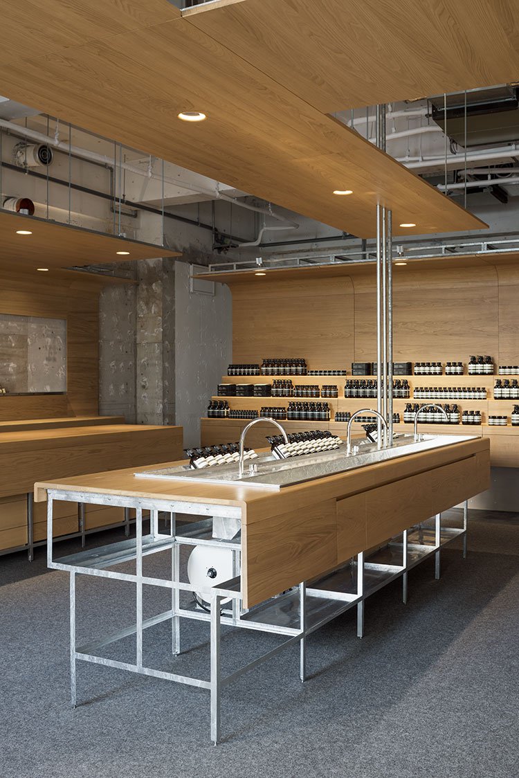
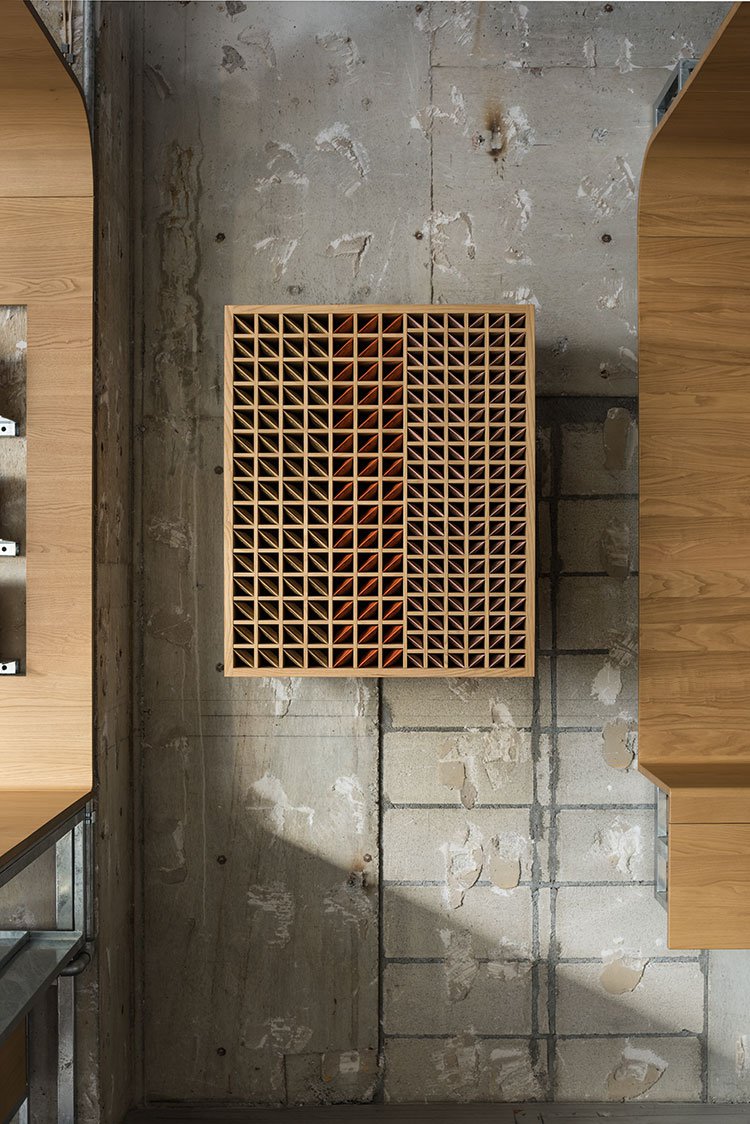
Taking apart the existing interior revealed a concrete skeleton space with signs of repeated repairs. While using the space as it is, a roundabout plan centered on a large sink and product shelves on the wall side organized like a tiered gallery by exploiting the size of the counter encompass the store interior.
The wooden parts of fixtures use entirely domestically produced chestnut wood, and since the architects aimed for a finish like that of high-quality furniture, they commissioned the furniture maker Karimoku to handle production.

In contrast with the parts that would be in contact with customers which were finished with smooth details that make one want to caress them, the parts that wouldn’t be in contact with customers have an exposed framework like unfinished furniture that is still in production. Including the framework, Torafu used steel materials to give the sink and façade a corrosive-resistant molten zinc coating and impart unity to the feel of the materials in the metal fittings.

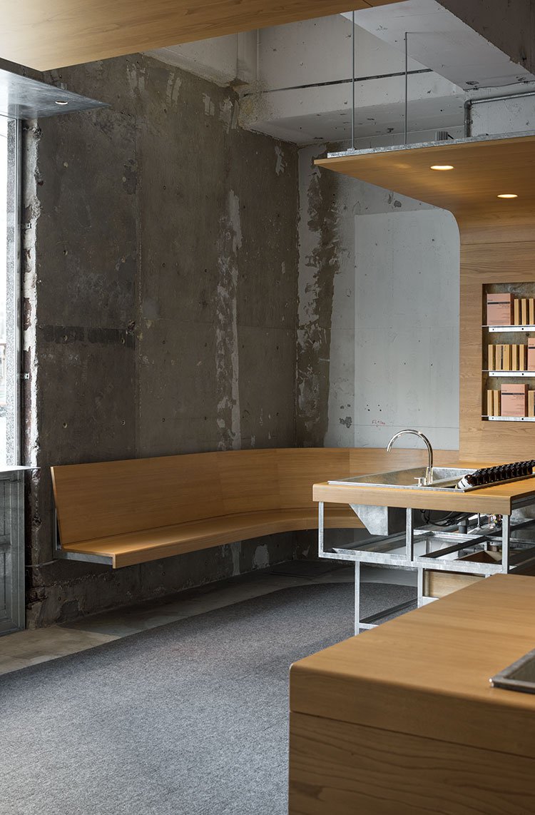
As for the floor, the studio spread a cashmere carpet on the existing concrete floor only in areas where customers would walk to give an impression of softness starting at the feet whenever people enter the store from the hard road surface.

The bench curves as stroking the corner at the window side and creates an intimate space with a sink set aside.
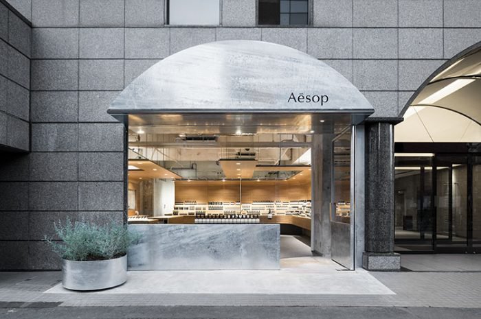
Serving as the face of the street-level store, the façade was designed to inherit the existing environment by adding eaves that appear to repeat the arch-shaped gate applied to the entrance of the next-door building.
“As though in response to the continuous renewal of Shibuya, we aimed to create a store space that possessed a dynamic contrast between the old and the new,” explains Torafu Architects.


